How to Choose a Perfect LinkedIn Cover Photo?
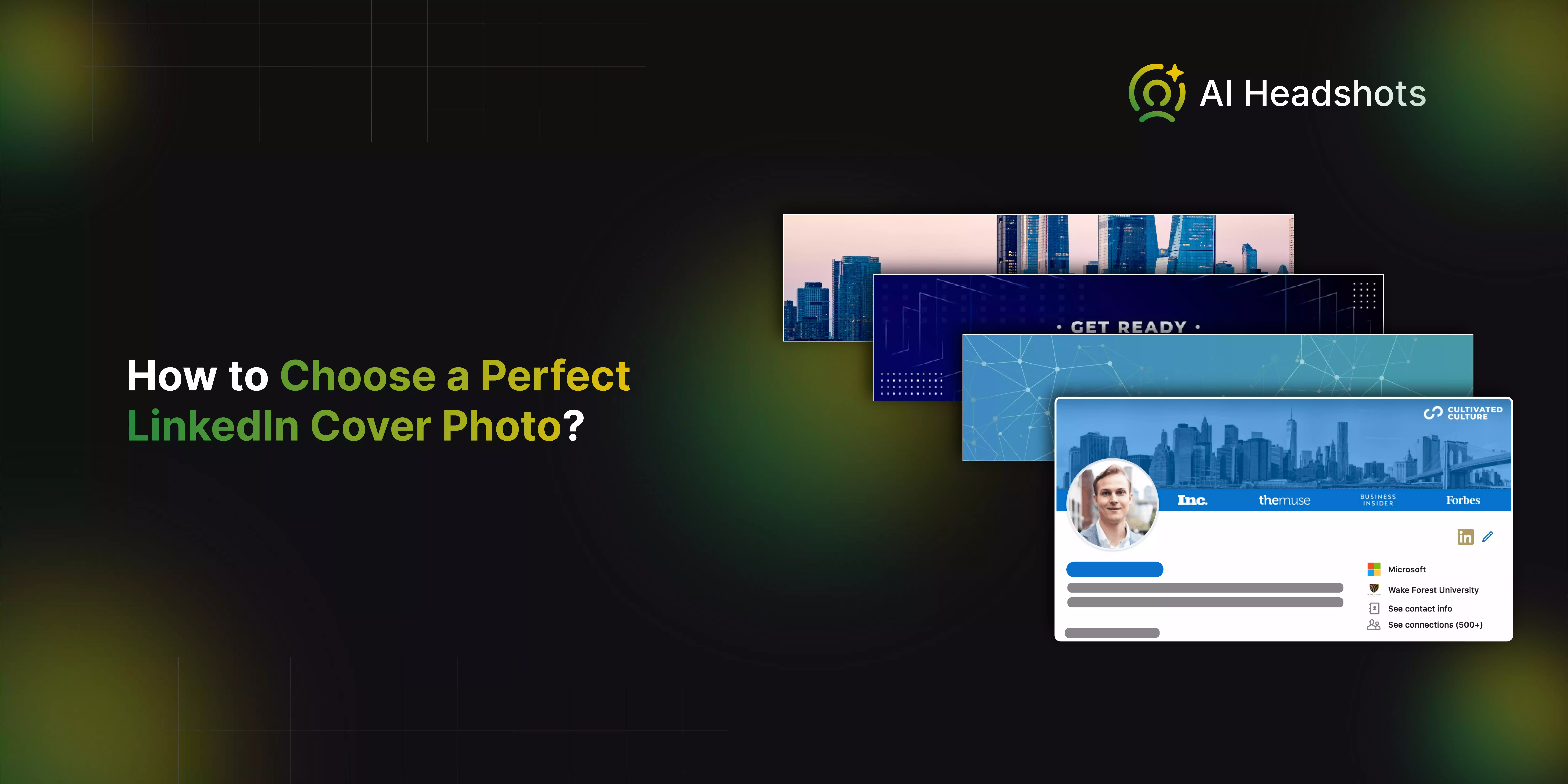

Choosing the perfect LinkedIn cover photo is a key step in creating a standout professional profile. Your cover photo is the first thing people notice when they visit your LinkedIn page, making it an excellent opportunity to make a great first impression. It serves as a visual introduction to who you are and what you’re about, setting the tone for your professional brand.
Whether you’re a job seeker, a business owner, or a professional looking to enhance your online presence, selecting the right cover photo can significantly impact how others perceive you. A well-chosen image can convey professionalism, showcase your industry, or reflect your personal brand’s unique personality.
In this guide, we’ll walk you through the essential considerations for picking a LinkedIn cover photo that aligns with your goals. We’ll cover tips on selecting the right image, ensuring it complements your profile picture, and optimizing it for the best visual impact. By following these guidelines, you can create a LinkedIn profile that not only stands out but also reinforces your professional image effectively.
Step-by-Step Guide to Choose an Awesome LinkedIn Cover Photo
Choosing the right LinkedIn cover photo is key to making a strong professional impression. This guide will walk you through selecting an image that reflects your brand, maintaining high quality, and ensuring it looks great on all devices. Follow these steps to enhance your LinkedIn profile effectively.
1. Choose an Image That Reflects Your Brand
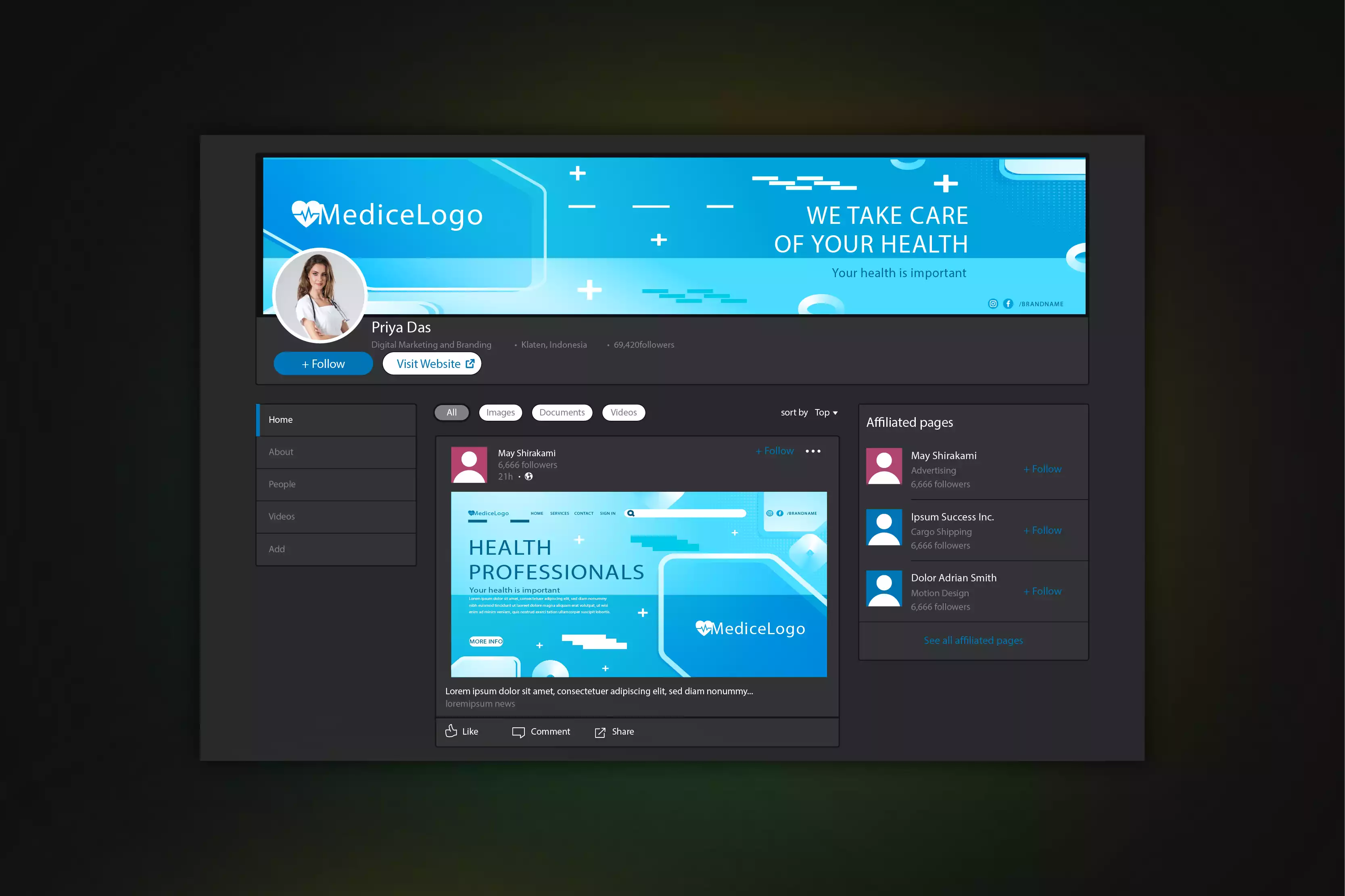
Selecting the right image for your LinkedIn cover photo is essential to convey your professional identity. Opt for an image that aligns with your personal brand and career goals. If you're in a creative field, consider a visually striking or abstract design. For corporate or business roles, choose clean, professional images like office settings or cityscapes.
Your cover photo should resonate with your industry and professional persona, adding a cohesive touch to your profile. Use free stock photo websites like Unsplash or Canva to find or create a high-quality image that represents you effectively. The goal is to select a photo that enhances your profile and reinforces your professional image.
Tips and tricks
- Match Your Industry: Select an image that aligns with your professional field. For creative roles, abstract or artistic designs work well, while corporate roles benefit from images of office environments or cityscapes.
- Keep It Professional: Ensure the image maintains a professional tone. Avoid casual or unrelated photos that don’t contribute to your professional image.
- Use High-Resolution Photos: Opt for high-quality, sharp images to avoid pixelation and maintain a professional appearance. Free stock photo sites like Unsplash or Pexels offer excellent high-resolution options.
- Incorporate Brand Elements: If applicable, include subtle elements of your personal or company brand, like colors or logos, to enhance brand recognition.
- Preview and Adjust: Test how your cover photo looks on different devices. Ensure key elements are visible and that the image displays correctly on both desktop and mobile versions of LinkedIn.
2. Ensure High Resolution and Quality

A high-resolution image is essential for a polished LinkedIn cover photo. To avoid blurry or pixelated visuals, select or create images with a resolution of at least 1584 x 396 pixels, which is LinkedIn’s recommended size. Use free design tools like Canva or Adobe Spark to adjust and ensure your photo is crisp and clear.
Avoid using low-resolution images that can detract from your profile’s professionalism. Preview your cover photo in LinkedIn’s profile editor to confirm it displays correctly on both desktop and mobile devices. By focusing on high quality, you ensure your LinkedIn cover photo makes a strong and professional impression.
Tips and tricks
- Use the Recommended Dimensions: Ensure your image is at least pixels to fit LinkedIn’s specifications without distortion.
- Choose High-Resolution Sources: Select images from high-resolution stock photo sites or design tools. Avoid using low-resolution images to prevent pixelation.
- Edit with Quality Tools: Utilize tools like Canva or Adobe Spark to adjust and enhance your image. These tools allow you to crop, resize, and fine-tune your photo for the best quality.
- Preview Before Finalizing: Always preview your cover photo on LinkedIn’s profile editor. Check how it appears on both desktop and mobile devices to ensure clarity and proper display.
- Avoid Over-Compression: When saving your image, avoid over-compressing it, as this can reduce quality. Use formats like PNG or high-quality JPEG to maintain image integrity.
3. Maintain a Professional Appearance
.webp)
Your LinkedIn cover photo should reflect your professional identity and complement your profile. Avoid casual or irrelevant images that don't align with your career goals or industry. Instead, choose visuals that enhance your professional image, such as clean, industry-related images for corporate roles or artistic designs for creative fields.
Ensure the image maintains a sophisticated and polished look, supporting your overall professional presence. Avoid cluttered or overly casual photos, as they can detract from your profile’s professionalism. By selecting a cover photo that aligns with your career aspirations and maintains a professional tone, you create a cohesive and impressive LinkedIn profile that effectively represents your brand.
Tips and tricks
- Choose Industry-Relevant Images: Select visuals that align with your field or career goals. For corporate roles, opt for clean, professional images like office settings or cityscapes. For creative fields, choose abstract or artistic designs that still convey professionalism.
- Avoid Casual Photos: Steer clear of overly casual or unrelated images. These can undermine the professional tone of your profile and detract from your overall image.
- Keep It Simple: Opt for a clean and uncluttered design. A minimalist approach often looks more professional and ensures that your cover photo doesn’t distract from your profile content.
- Consistency with Profile Picture: Ensure your cover photo complements your profile picture. A cohesive look between the two creates a stronger professional presence.
- Reflect Your Brand: Use your cover photo to highlight your brand or expertise subtly. Incorporate elements that align with your career objectives to reinforce your professional identity.
4. Test and Adjust
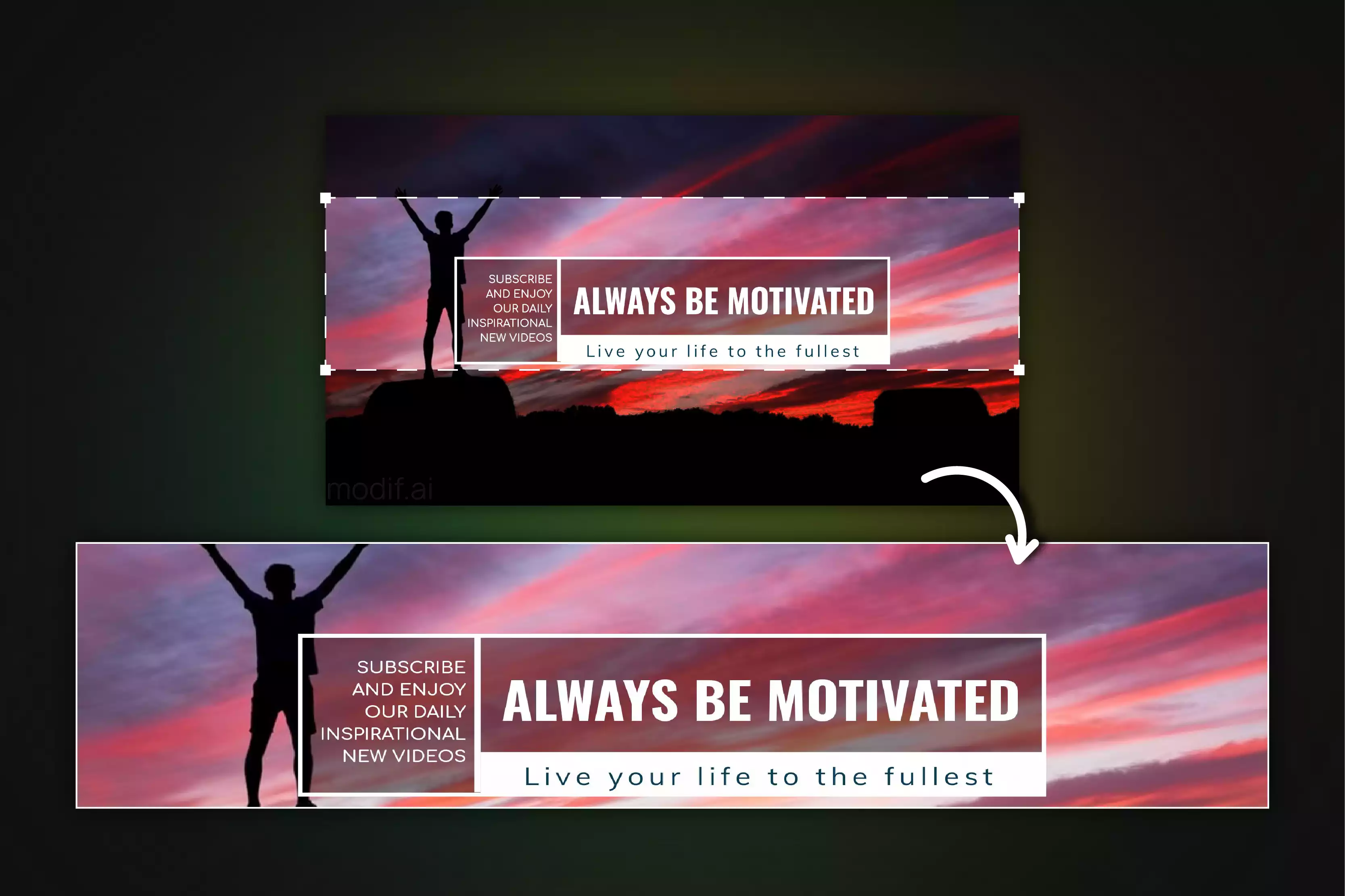
After uploading your LinkedIn cover photo, it’s crucial to check how it appears on different devices to ensure it displays correctly. Preview the photo on both desktop and mobile views to identify any cropping, distortion, or alignment issues. Make sure all important elements, such as text or logos, remain visible and properly centered.
If necessary, adjust the image to ensure it maintains a professional and consistent appearance across all devices. Regularly testing and updating your cover photo ensures it remains relevant and effectively represents your professional brand. By verifying how your cover photo looks on various screens, you ensure a polished and cohesive presentation on your LinkedIn profile.
Tips and tricks
- Check Across Devices: View your cover photo on both desktop and mobile devices to ensure it looks good on all screen sizes. This helps catch any cropping or distortion issues.
- Center Key Elements: Position important elements, like text or logos, towards the center of the image. This ensures they remain visible and not cropped out on different devices.
- Adjust for Clarity: If parts of your photo are not displaying correctly, make necessary adjustments to the image size or placement. Ensure that the photo remains clear and professional.
- Regular Updates: Periodically review and update your cover photo to keep it fresh and aligned with your current professional image.
- Seek Feedback: Ask colleagues or friends to review how your cover photo appears on their devices. Fresh eyes can help spot issues you might have missed.
5. Align with Your Personal Brand
.webp)
Aligning your LinkedIn cover photo with your personal brand means selecting an image that reflects your professional identity, values, and career goals. This could involve using visuals related to your industry, such as a tech-themed backdrop for IT professionals or a creative design for those in the arts.
Your cover photo should reinforce the message you want to convey about your professional persona, whether it’s showcasing your expertise, emphasizing your role, or aligning with your company’s brand. A well-chosen image helps create a cohesive and impactful presence, making your profile more engaging and memorable to viewers.
Tips and tricks
- Reflect Your Industry: Choose a cover photo that resonates with your field, such as a tech-themed design for IT professionals or an artistic image for creatives.
- Highlight Your Expertise: Use visuals that subtly emphasize your skills or area of expertise, like a backdrop with relevant keywords or tools.
- Stay Consistent with Brand Colors: Incorporate your personal or company brand colors to create a visually cohesive and recognizable profile.
- Include Relevant Elements: Feature tools or symbols related to your profession, such as books for writers or charts for financial advisors.
- Keep It Professional: Ensure the image is high-quality and appropriate for a professional setting, avoiding overly casual or unrelated visuals.
6. Choose a Relevant Background

Your LinkedIn cover photo should reflect your industry or profession, helping to convey your professional identity at a glance. Select a background that is relevant to the work you do, such as financial charts for a finance professional or creative designs for someone in the arts.
The background should not only be visually appealing but also meaningful, reinforcing the message you want to communicate about your expertise and career. By choosing a relevant background, you make your profile more cohesive and engaging, helping potential employers or clients immediately understand what you’re all about.
Tips and tricks
- Align with Your Industry: Select a background that reflects the field you work in, such as tech visuals for IT or creative designs for the arts.
- Keep It Meaningful: Ensure the background adds value to your profile by reinforcing your professional identity.
- Avoid Clutter: Choose a simple, clean background that doesn't distract from your profile picture or headline.
- Match Your Brand: Use colors and themes that are consistent with your personal or company branding.
- Test Different Options: Experiment with various backgrounds to see which one best conveys your message and enhances your profile.
7. Incorporate Your Company’s Branding
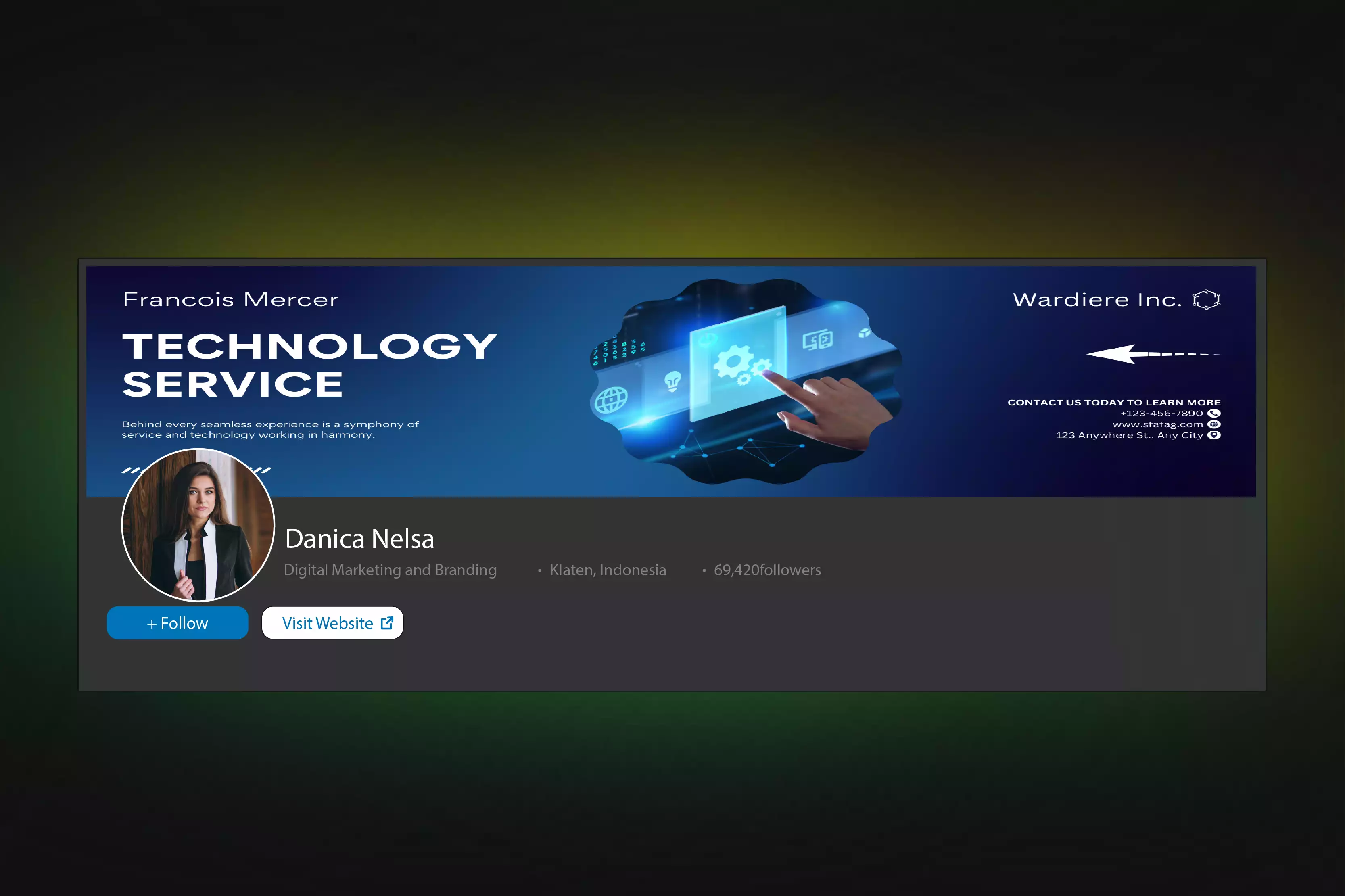
Including your company’s branding in your LinkedIn cover photo can enhance your professional image and align your profile with your organization’s identity. Use elements like your company’s logo, brand colors, or design themes to create a cohesive look. This integration helps reinforce your connection to the company and makes your profile more recognizable.
For instance, if your company has specific color schemes or visual motifs, incorporate these subtly into your cover photo. This not only supports your brand but also shows that you are aligned with your company’s values and aesthetics, making your profile more professional and engaging.
Tips and tricks
- Use Brand Colors: Integrate your company’s official colors into your background to create a cohesive look that aligns with the company’s visual identity.
- Include the Company Logo: If appropriate, add your company’s logo to your cover photo to reinforce brand recognition and show your connection to the organization.
- Follow Brand Guidelines: Adhere to your company’s branding guidelines to ensure that your cover photo aligns with the official visual style and messaging.
- Keep It Subtle: Incorporate branding elements in a way that enhances your profile without overwhelming or distracting from your content.
- Update for Major Changes: Refresh your cover photo to reflect any significant updates in company branding, such as a new logo or color scheme.
8. Showcase Your Work or Achievements
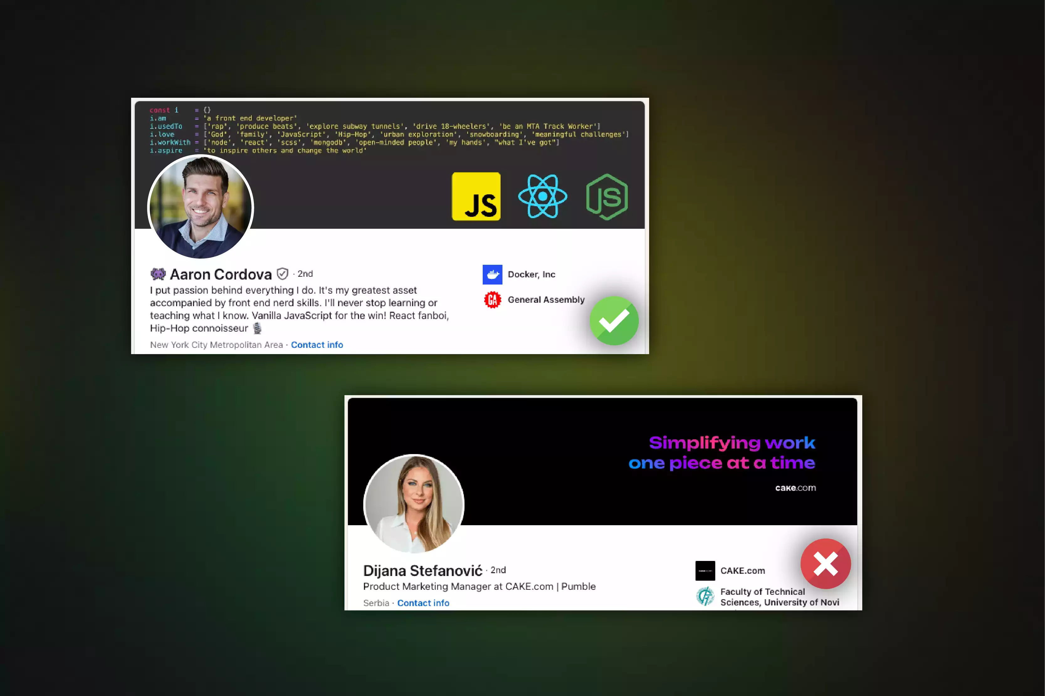
Highlighting your work or achievements in your LinkedIn cover photo can create a powerful impression and emphasize your professional strengths. Use your cover photo to feature visual elements related to key projects, awards, or milestones you’ve reached in your career. For instance, you might include a snapshot of a successful project, a prestigious award, or a significant accomplishment in a visually appealing way.
This not only draws attention to your skills and successes but also makes your profile more engaging and informative. By showcasing your work or achievements, you provide potential employers or clients with a clear view of your capabilities and accomplishments, setting you apart from others.
Tips and tricks
- Feature Key Projects: Highlight images or elements related to significant projects you’ve worked on, making your achievements visible and impactful.
- Include Awards or Milestones: Display visual representations of awards, certifications, or milestones to emphasize your accomplishments and add credibility.
- Use Visuals: Incorporate charts, graphs, or screenshots that illustrate your success or expertise in a visually appealing manner.
- Keep It Relevant: Choose work or achievements that are most relevant to your current career goals or the job you’re seeking.
- Maintain Professionalism: Ensure that all visuals are high-quality and presented professionally, avoiding clutter or overly complex images.
9. Use Text Wisely
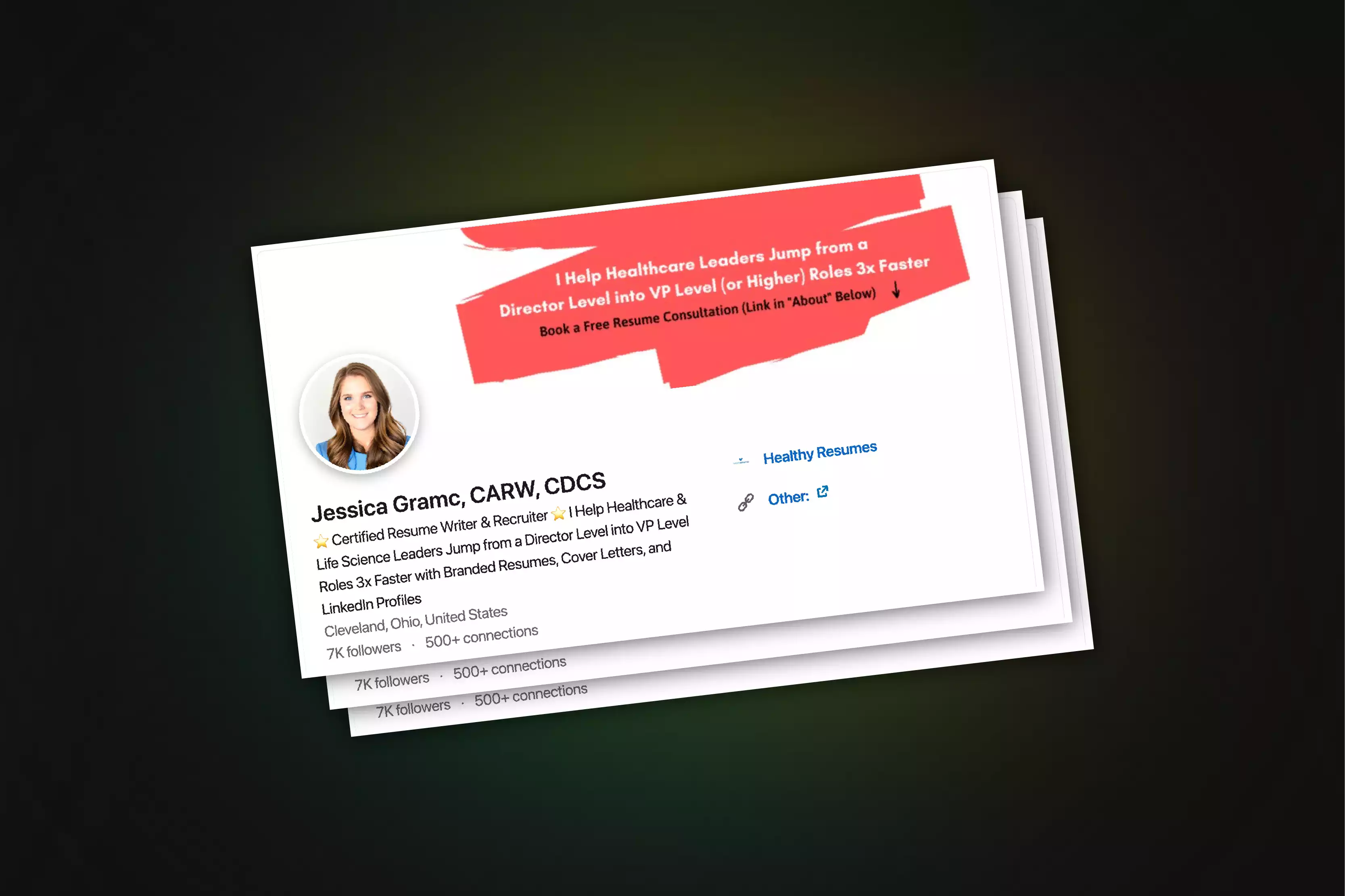
Incorporating text into your LinkedIn cover photo can be effective, but it needs to be done thoughtfully. Use text to convey key messages or highlight your professional brand, such as your job title, key skills, or a brief tagline. Ensure the text is concise, easy to read, and complements the overall design.
Avoid overcrowding the cover photo with too much information; instead, focus on a few key points that enhance your profile without distracting from your visual identity. Select fonts and colors that are professional and match your personal or company branding. By using text wisely, you can clearly communicate your message while maintaining a clean and polished appearance.
Tips and tricks
- Be Concise: Limit the amount of text to key information, such as your job title or a brief tagline, to avoid clutter.
- Choose Readable Fonts: Use clear, professional fonts that are easy to read and fit with your personal or company branding.
- Ensure Contrast: Select text colors that stand out against the background to ensure readability.
- Position Text Strategically: Place text in areas where it won’t overlap with your profile picture or other important elements.
- Keep It Professional: Avoid using overly decorative or casual fonts, and ensure that the text aligns with your professional image.
10. Update Regularly

Keeping your LinkedIn cover photo up to date is crucial for maintaining a current and relevant professional presence. Regularly update your cover photo to reflect significant changes in your career, such as new roles, achievements, or shifts in your professional focus. An updated cover photo shows that you are active and engaged on the platform, and it helps to keep your profile aligned with your latest accomplishments and goals.
Periodically refreshing your cover photo also provides an opportunity to experiment with new designs or messages that better represent your evolving professional brand, ensuring that your profile remains engaging and reflective of your current status.
Tips and tricks
- Reflect Career Changes: Update your cover photo to match new roles, achievements, or career shifts to keep your profile current.
- Highlight Recent Accomplishments: Include visuals or text that showcase recent successes or milestones to keep your profile engaging.
- Align with Current Goals: Adjust your cover photo to reflect your current professional focus or goals, ensuring it aligns with your evolving brand.
- Refresh Design Periodically: Experiment with new designs or messages to keep your profile visually appealing and up-to-date.
- Check for Relevance: Ensure the cover photo remains relevant to your industry and personal branding to maintain a professional image.
Avoid These Common Mistakes When Choosing Your LinkedIn Cover Photo
Your LinkedIn cover photo is a key part of your professional image, but common mistakes can undermine its effectiveness. To make a strong impression, use low-resolution images, pay attention to proper dimensions, and avoid overloading with text. Ensuring your cover photo is clear, well-centered, and looks great on all devices will help you stand out professionally.
- Using Low-Resolution Images: Blurry or pixelated photos look unprofessional. Always use high-resolution images to ensure clarity.
- Ignoring Dimensions: Not following LinkedIn’s recommended size (1584 x 396 pixels) can lead to cropping or distortion. Adhere to these dimensions for the best fit.
- Placing Key Elements at the Edges: Important text or logos placed near the edges may get cropped. Center them within the safe zone to keep them visible.
- Choosing Casual or Irrelevant Images: Avoid images that don’t align with your professional image or industry. Select visuals that reflect your career goals.
- Neglecting Mobile View: Check how your cover photo appears on both desktop and mobile devices to ensure a consistent look.
- Overloading with Text or Graphics: Busy designs can look unprofessional. Keep your cover photo clean and focused for a strong impact.
How Can an AI Headshot Generator Create a Flawless Headshot Without Posing?
Creating a flawless headshot typically requires careful posing, lighting, and professional photography. However, with AI Headshot Generator, achieving a perfect headshot is possible without any posing. The platform uses advanced AI technology to analyze and enhance everyday photos, transforming them into professional-quality headshots. It automatically adjusts facial features, lighting, and background, ensuring that the final image is polished and professional.
One of the key benefits of using AIHeadshotGenerator.media is its ability to subtly enhance your features without requiring a professional photographer's guidance. The AI can correct common issues such as uneven lighting or distracting backgrounds, which might otherwise detract from the quality of the photo. It also employs sophisticated algorithms to make adjustments that flatter your appearance, such as softening harsh lines and improving skin tone, all without needing you to hold a specific pose.
Moreover, AIHeadshotGenerator.media saves time and effort. Instead of spending time at a photo studio or struggling to find the right pose and expression, you can upload a photo from your gallery. The AI handles the rest, delivering a high-quality headshot that reflects professionalism and confidence. This convenience and efficiency make it an excellent tool for professionals needing quick and reliable headshot solutions.
Conclusion
Crafting the perfect LinkedIn cover photo is essential for creating a strong professional presence. By choosing an image that reflects your brand, ensuring it aligns with your career goals, and optimizing it for different devices, you can make a memorable first impression. A well-thought-out cover photo can set you apart and enhance your profile's overall appeal. To make this process even easier, consider using a tool like AIHeadshotGenerator.media to create a high-quality, professional cover photo effortlessly.
FAQ's
Your LinkedIn cover photo should be 1584 x 396 pixels to ensure it fits well and appears clear across all devices.
While you can use various images, it's best to select one that aligns with your professional identity and industry. Avoid casual or irrelevant images to maintain a polished profile.
Preview your cover photo on both desktop and mobile views. Make sure key elements are centered and visible on all screen sizes to prevent cropping or distortion.
Ensure you use a high-resolution image with the recommended dimensions. If the photo appears pixelated, try using a higher-quality image or resizing it appropriately.
Regularly updating your cover photo, such as when you change jobs or achieve new milestones, keeps your profile current and reflects your latest professional status.


